CSS Customize & Theme
CSS Variables
This section describes how to use CSS variables to customize the theme of the components.
We use CSS variables to define colors and other styles like below:
:root {
  --wkit-accent-hs: 210, 100%;
  --wkit-on-accent-rgb: 255, 255, 255;
  --wkit-bg-rgb: 239, 241, 245;
  --wkit-on-bg-rgb: 10, 14, 34;
  --wkit-font-family: 'Inter', sans-serif;
  --wkit-font-family-mono: 'IBM Plex Mono', monospace;
  --wkit-font-size-large: 18px;
  --wkit-font-size-medium: 16px;
  --wkit-font-size-small: 14px;
  --wkit-line-height-large: 22px;
  --wkit-line-height-medium: 20px;
  --wkit-line-height-small: 17px;
  --wkit-button-width: 284px;
  --wkit-border-radius: 16px;
}
Below is a list of all CSS variables that you can use as public API to customize the look of the components.
| CSS Variables | Descriptions | Default Value |
|---|---|---|
--wkit-accent-hs | The hue and saturation components of the accent color. | 210, 100% |
--wkit-on-accent-rgb | The RGB value of the color on the accent color. | 255, 255, 255 |
--wkit-bg-rgb | The RGB value of the background color. | 239, 241, 245 |
--wkit-on-bg-rgb | The RGB value of the color on the background color. | 10, 14, 34 |
--wkit-font-family | The font-family of the components. | 'Inter', sans-serif |
--wkit-font-family-mono | The font-family of the components (monospace). | 'IBM Plex Mono', monospace |
--wkit-font-size-large | The font-size of the components (L). | 18px |
--wkit-font-size-medium | The font-size of the components (M). | 16px |
--wkit-font-size-small | The font-size of the components (S). | 14px |
--wkit-line-height-large | The line-height of the components (L). | 22px |
--wkit-line-height-medium | The line-height of the components (M). | 20px |
--wkit-line-height-small | The line-height of the components (S). | 17px |
--wkit-button-width | The width of the button. | 284px |
--wkit-border-radius | The border radius of the components. | 16px |
Default Values:
After figuring out the CSS variables you want to customize, you can override them in your own CSS file, like below:
:root {
  --wkit-accent-hs: 110, 100%; // Redefine the hs (the first two components of hsl) of the accent color

  ... // other CSS variables
}
Import the default CSS file and your own CSS file in your application.
The CSS variables must be imported / declared AFTER the default CSS file.
For example, in the src/index.jsx file:
import '@suiet/wallet-kit/style.css';
import './suiet-wallet-kit-custom.css'; // You CSS file here
Override (Not recommended)
When CSS variables are not enough, you can customize the styles by importing the CSS file and overriding our default CSS rules.
Override our default CSS rules is not recommended because it is not easy to maintain. If you have any questions or feature requests, please contact us.
Fellow the steps below to customize the styles:
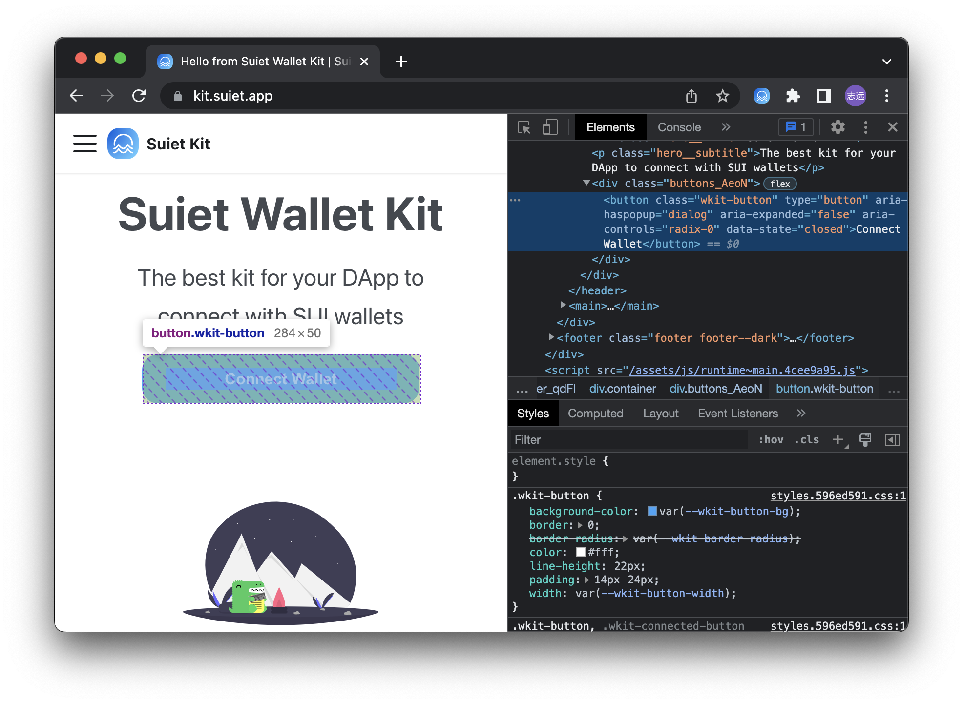
First, figure out the CSS class name of the component you want to customize. For example, the CSS class name of the ConnectButton component is wkit-button.
CSS Class Names Reference
Below are the CSS class names used by different components that you can customize:
AccountModal Component
| CSS Class Name | Description |
|---|---|
wkit-account-modal__content | Main content container of the account modal |
wkit-account-modal__info | Information section containing name and address |
wkit-account-modal__name | Display name or SuiNS name |
wkit-account-modal__address | Wallet address display |
wkit-account-modal__address--primary | Primary address variant (when no SuiNS name) |
wkit-account-modal__actions | Container for action buttons |
wkit-account-modal__action-button | Individual action button (copy, disconnect) |
wkit-account-modal__action-button--disconnect | Disconnect button variant |
wkit-account-modal__action-button-text | Text inside action buttons |
wkit-account-modal__action-button-text--danger | Danger text variant for disconnect |
Dialog/Modal Shared Classes
| CSS Class Name | Description |
|---|---|
wkit-dialog__overlay | Modal overlay background |
wkit-dialog__content | Modal content container |
wkit-dialog__header | Modal header section |
wkit-dialog__title | Modal title text |
wkit-dialog__close | Close button |
ConnectModal Component
| CSS Class Name | Description |
|---|---|
wkit-select__scroll | Scrollable wallet list container |
wkit-select__container | Wallet section container |
wkit-select__title | Section title (e.g., "Popular", "Others") |
wkit-select-item | Individual wallet item |
wkit-select-item__icon | Wallet icon container |
wkit-select-item__icon-img | Wallet icon image |
Button Component
| CSS Class Name | Description |
|---|---|
wkit-button | Main connect button |
Then override the styles in your own CSS file.
.wkit-button {
  height: 64px; // For example, override the height of the button
}

/* Customize AccountModal */
.wkit-account-modal__content {
  padding: 24px 0; // Increase padding
}

.wkit-account-modal__name {
  color: #2563eb; // Change name color to blue
  font-size: 20px; // Increase font size
}

.wkit-account-modal__action-button {
  border-radius: 8px; // Make buttons more rounded
  padding: 12px 16px; // Increase button padding
}

.wkit-account-modal__action-button--disconnect {
  background-color: rgba(220, 38, 38, 0.1); // Custom disconnect button color
}
And last, import the default CSS file and your own CSS file in your application.
Your CSS rules must be imported / declared AFTER the default CSS file.
For example, in the src/index.jsx file:
import '@suiet/wallet-kit/style.css';
import './suiet-wallet-kit-custom.css'; // You css file here